Thursday, November 15, 2018


4 Websites
1) Using a projector
https://petapixel.com/2015/01/01/projector-brought-forest-turns-nature-glowing-wonderland/

a) I saw a lot of clips of nature and differnet animals inside a forest. I also saw a glowing animation that Friedrich van Schoor put onto the video. I made it appear like things came to life and moved.

b) Tarek Mawad was the photographer while Friedrich van Schoor was the animator. Both are known to use this method of using a projector to make things appear as they are glowing.

c) The two artists spent several weeks illuminating surfaces in the forest with a powerful projector. The result was a glowing lifelike look that they were able to capture on camera.

d) I learned that animators often team up with photographers to make one another's work more unique. Their specialties compliment each other and it can result in a one of a kind product.

2) Great Portraits
https://www.picturecorrect.com/tips/how-to-take-great-portraits/

how to take great portraits

a)  I picked this photo because it follows all the tips of a great portrait. The photographer takes advantage of posing, lighting, and personality.

b) I see balance, simplicity, and an intentional merger in this picture.

c) Photo taken by Morki Ro

3) Killer Timelapse
https://blog.ted.com/how-to-create-a-killer-timelapse-with-joe-capra/

a) I saw a bunch of time-lapses of Rio. A lot of the clips focused on cars, the sea, or clouds. These are things that we can see move in normal time but seeing them sped up looks really cool.

b) Joe Capra is the creator of these time-lapses. He has done many projects just like this, some of his most well known are his videos of the northern lights.

c) The process of creating a time lapse can be more rigorous than you may have thought. Joe Capra must think of things like where the sun is rising and setting or what kind of gear he needs. However, putting in this extra work is what lets him capture these breathtaking time-lapses.

d) I learned that making one of these videos takes much more than just setting up a camera. Many factors come into play when taking a video of the same thing over several hours. I learned about many different tools that people use specifically for these types of videos.

4)  The oldest living things on Earth
http://www.rachelsussman.com/oltw/
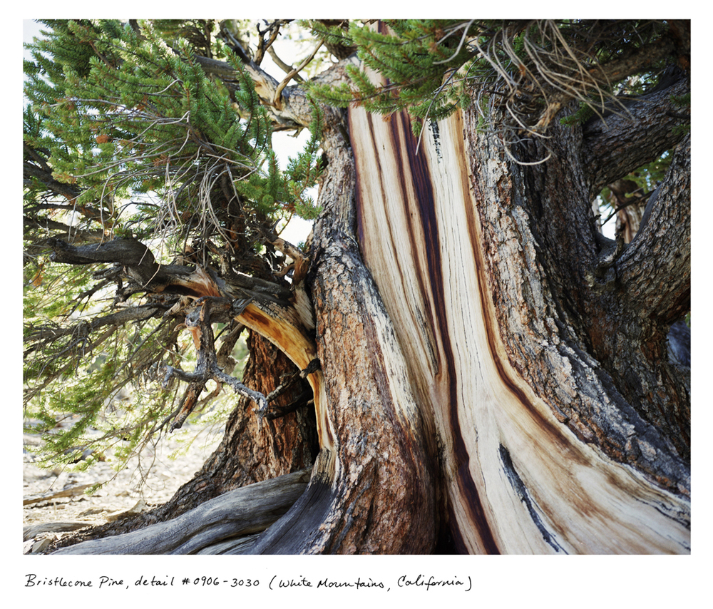
09_Sussman_Bristlecone_0906_3030_1068px.jpg

a) I chose this picture because I like pictures of trees. I also like the patern of the grain of the tree and the subble green color of the branches.

b) I see lines in the grain of the tree and the grain is also a pattern.

c) The photo is by Rachel Sussman

Tuesday, November 13, 2018

Thursday, November 8, 2018

Magazines Part 2

Image Based-
Usually has one person and is used for almost all fashion and men magazines. The person on the cover is usually a celebrity and is sometimes smiling. The person on the cover is what sells the magazine. Can also just be a picture of the subject of the magazine, doesn't have to be a person.

Illustration Based-
Covers that are hand drawn (used until the 1930s). Still used sometimes today to present something funny or out of the ordinary however not many organizations use illustrated baed covers anymore. There are a number of magazine organizations that rely on computer developed designs.

Type Based-
Tend to be shocking or striking and are rare (not as rare as illustration based covers). It is important how you present the words to convey emotion or a message beyond the words. Sometimes words on these covers present the subject much better than a photo could. There are often small images to accompany the words but the words are still the pain part of the cover.

Concept Based-
A combination of image based, illustration based, and type based covers. The cover has to be instantly understandable to the reader. This type of magazine is also rare but is found in business magazines, news weekly magazines, and independent magazines. The cover is best used to convey a strong message in a funny way.

Words and Pictures-
Words and pictures can be used to accompany each other in magazines. Either one can be the main subject of the cover as long as it coveys the message the the magazine is supposed to . Both can be found on a lot of magazines because pictures are eye catching and words provide information.


Tuesday, November 6, 2018

My Favorite Cover


"When the World's Greatest Living Athlete is also an off-the-court phenom in business, in movies, and increasingly in politics, the time allotted for a photo shoot is limited (it was 45-minutes from the frame to the last). But photographer Pari Dukovic nevertheless captured LeBron James in a timeless, almost deified image that shows the strength, fierceness, and regal nature of GQ’s November cover subject. One worthy of blowing up and framing like a piece of art (which we did)."

This cover is a formal portrait. They do a nice job of filling the frame with Lebron and match it with a very simple background. The background choice is very good because the colors complement his skin tone. It also makes the gold crown that he is wearing stand out more because of the lighting that is reflected off of it. The lighting in the picture has a lot of shadows but lights u key parts of his face like his cheeks. They cut him off at the shoulders which works well because that is one of the places you can cut someone off from the rest of their body in a picture.
Best Covers

Best Entertainment & Celebrity
1) Informal
2) Environmental
3) Formal
4) Informal
5) Formal
6) Informal

Best Service & Lifestyle
7) Informal
8) Environmental
9) Environmental
10) Formal
11) Formal

Best Sports & Fitness
12) Formal
13) Enviromental
14) Environmental
15) Informal
16) Environmental
17) Formal

Best Fashion and Beauty
18) Informal
19) Formal
20) Formal
21) Formal 
22) Environmental

Readers Choice Awards
23) Environmental
24) Formal
25) Environmental
26) Environmental
27) Formal


Magazine Tips

1) Make the cover emotionally irresistible or appealing.
2) Make the cover pull the readers glance to it and provoke curiosity.
3) Make the cover interesting or intellectually stimulating.
4) Make the cover easy to scan or look at.
5) Make the cover familiar looking so people recognize the brand.

Thursday, November 1, 2018


Self Portraits

1) Alter your perspective
2) Shoot some kind of mirror or something that has a reflection
3) Break the Rules of Composition
Image result for environmental portrait p

I chose this picture because of the color on the bottom half and I like how the sky has a gradient from dark to light.
Image result for environmental portrait p

I chose this picture because of all the little details in the background. There are a lot of little splashes of color and it moves my eye all over the picture.
Image result for photography self portrait

I chose this one because even though the photographer uses a mirror, they still fill the frame very nicely. Also when I see this, certain colors come to my mind like yellow, green, and blue.
Image result for photography self portrait

I chose this picture because the way the photographer set it up was very creative. You can't really see the photographer in the mirror first but once you do, your eyes start to follow patterns made by the mirrors.
Image result for casual portraits

I chose this picture because I like the vibrant green in the grass and the trees. I also like how the light just comes out of one corner. I also just like pictures of dogs.
Image result for casual portraits

I chose this picture because I like how they timed the picture right to get a picture of both the kids blowing on the dandelions. I also just think that it is a cute picture.

For my portrait project, I would like to take pictures of my friend playing video games. I would take these pictures in his room because that is where he would feel comfortable. The screen of the monitor displays a cool glow on his face and it would make for a a good picture. His eyes also reflect the light almost telling a story of the hard work he is putting in on his game. I would make the background out of focus by adjusting the aperture to make the colored LEDs in the background just look like cool blurs that add to the picture instead of distract. I would use the rules of composition such as simplicity and rule of thirds.
Ethics in Fashion Photography

1) They made her

  • neck longer
  • eyes bigger
  • cheeks narrower
  • lips bigger
  • eyes lower
2) Video Restricted
3) Video Restricted
4) No its not ethical to edit your appearance because you shouldn't be able to change your appearance like that because you are showing yourself as someone who you are not.
5) It could be more wrong if you were made to look like someone specifically that you weren't.
6) I think super small changes like blurring out a pimple are not bad.
7) In fashion photography, you don't need a lot of words to tell the story and you can say it all with pictures and short captions. In photojournalism, the pictures are accompanied by a long story, not just captions.
8) Each type of photography is drawn together because they are all art forms. This art can be manipulated in unethical ways.
9) To show us not to believe all the pictures that we see are 100% real.
10) These videos are about girls because girls are more likely to change their appearance with makeup or plastic surgery than guys.

Tiny Planets